By Julia Mullins, Co Editor-in-Chief
From brochures and business cards, to banners and maps, the University of Bristol logo is stamped across campus. The signage cemented in metal, vinyl, and ink. So how long should it take to change a logo?
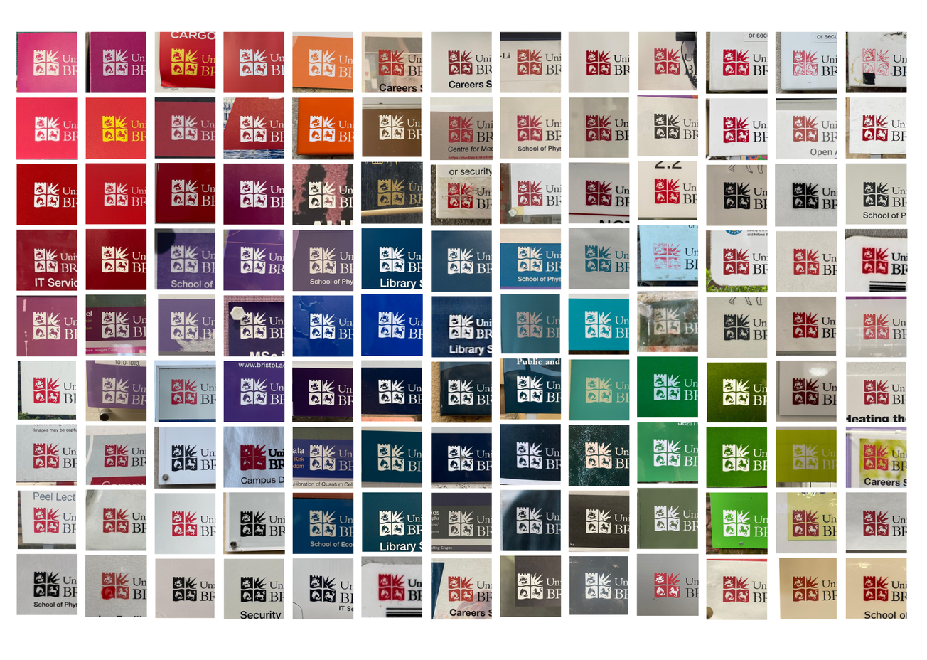
In early February, over three days, I photographed over 150 outdated University of Bristol logos across more than a dozen university buildings.
In 2024, the University of Bristol unveiled a new logo, a change which removed the Colston family emblem due to their role in the transatlantic slave trade.
The legacies of slavery report led to a consultation regarding the renaming of buildings. The outcome of this was announced by Evelyn Welch in an open letter and included a 10 year, £10m ‘Reparative Futures’ programme, and the modernisation of the logo.
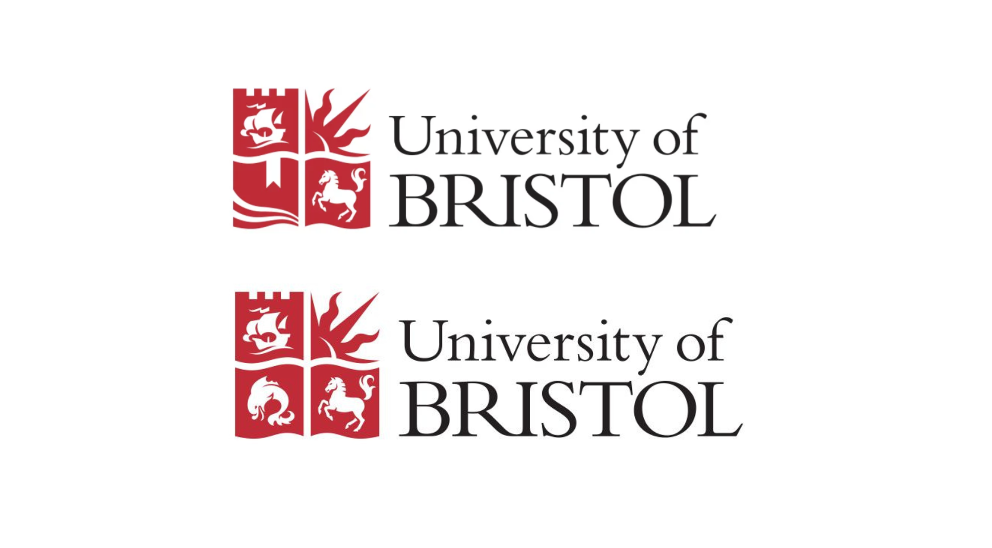
The dolphin in the bottom left quadrant, was replaced with an open book which, according to the university, ‘reflects the institution's core mission - education and learning.’
You can see the logo's polished design evolution on a dedicated page of the University of Bristol website, but on campus things look a little different.
According to a University of Bristol press release from February 2024, the replacement of the logo would be phased to ‘limit wastage’ and remain ‘cost effective.’
The same press release states that the ‘logo will be updated on digital platforms first along with some prominent signage on campus,’ and changes to other signage are to be made when it needs replacing.
When the new logo was announced, the university didn't commit to a timeframe for the physical changes to take place, but said that ‘there is likely to be a mix of logos used across the university for some time.’ Epigram even wrote in 2024 that ‘it will take several years to entirely replace the old logo.’
Two years on from the announcement, Epigram has been out on campus to document the physical progress of this change, and find out what the university means by ‘some time.’
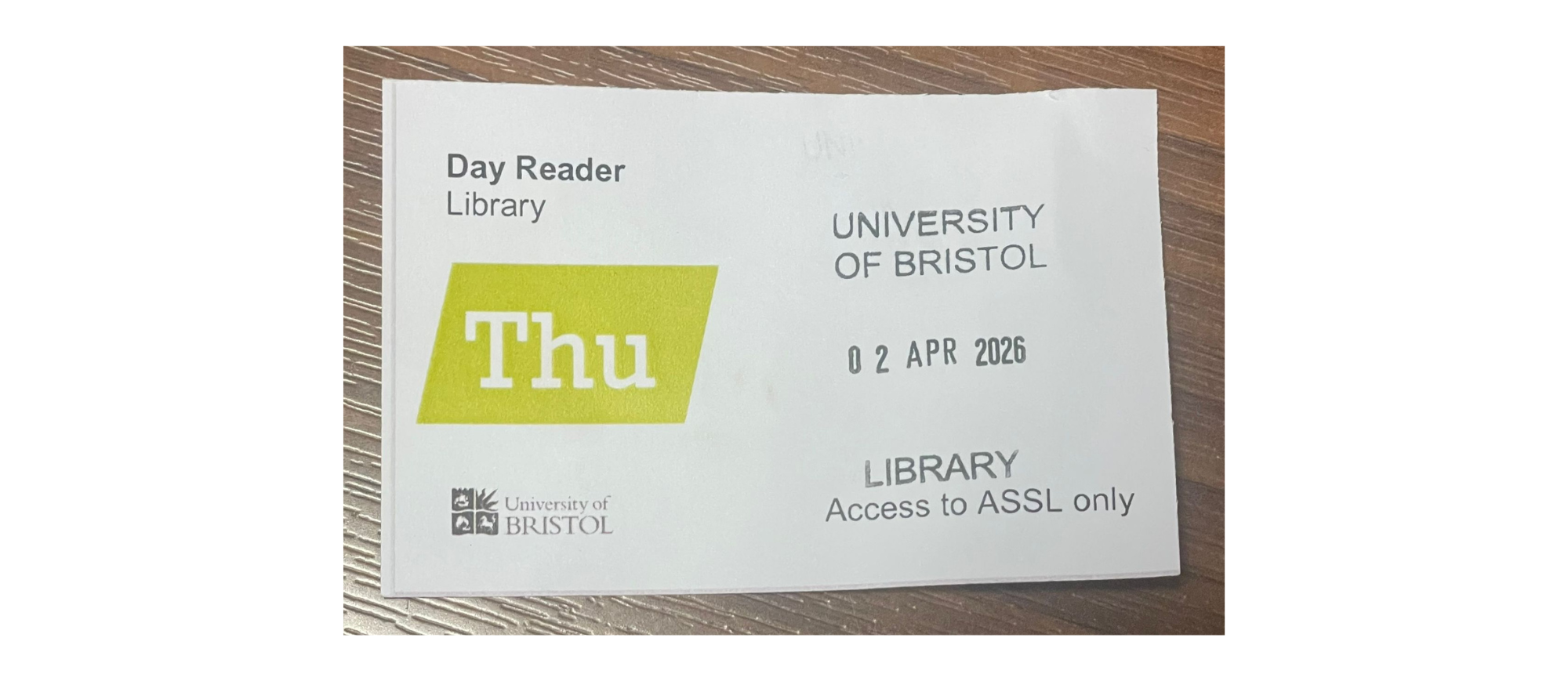
Significant changes have been made – the likelihood is that if you want to pose for a graduation picture you'll probably find yourself stood in front of the new logo – but what about the ones that don't get snapped? The logos smaller than your fingernail, stuck to the back of PCs.
This all began with one tired looking laminated poster in the newly refurbished Arts and Social Sciences Library (ASSL). Having reopened last term, after months of closure and a £1.8m renovation, you wouldn't expect to find the Colston dolphin above a recycling bin.
Understandably, the task of replacing logos across an entire university campus is costly, but, considering the library took five months to fully reopen and cost £1.8m to renovate, it is surprising that this change wasn't made. Particularly considering many of the logos I found were simply printed paper or laminate.
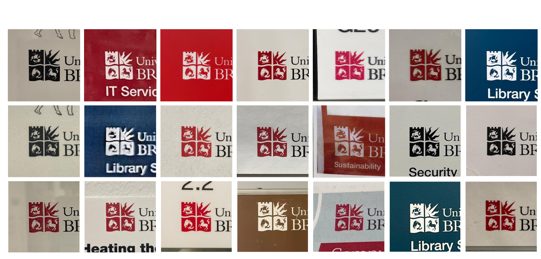
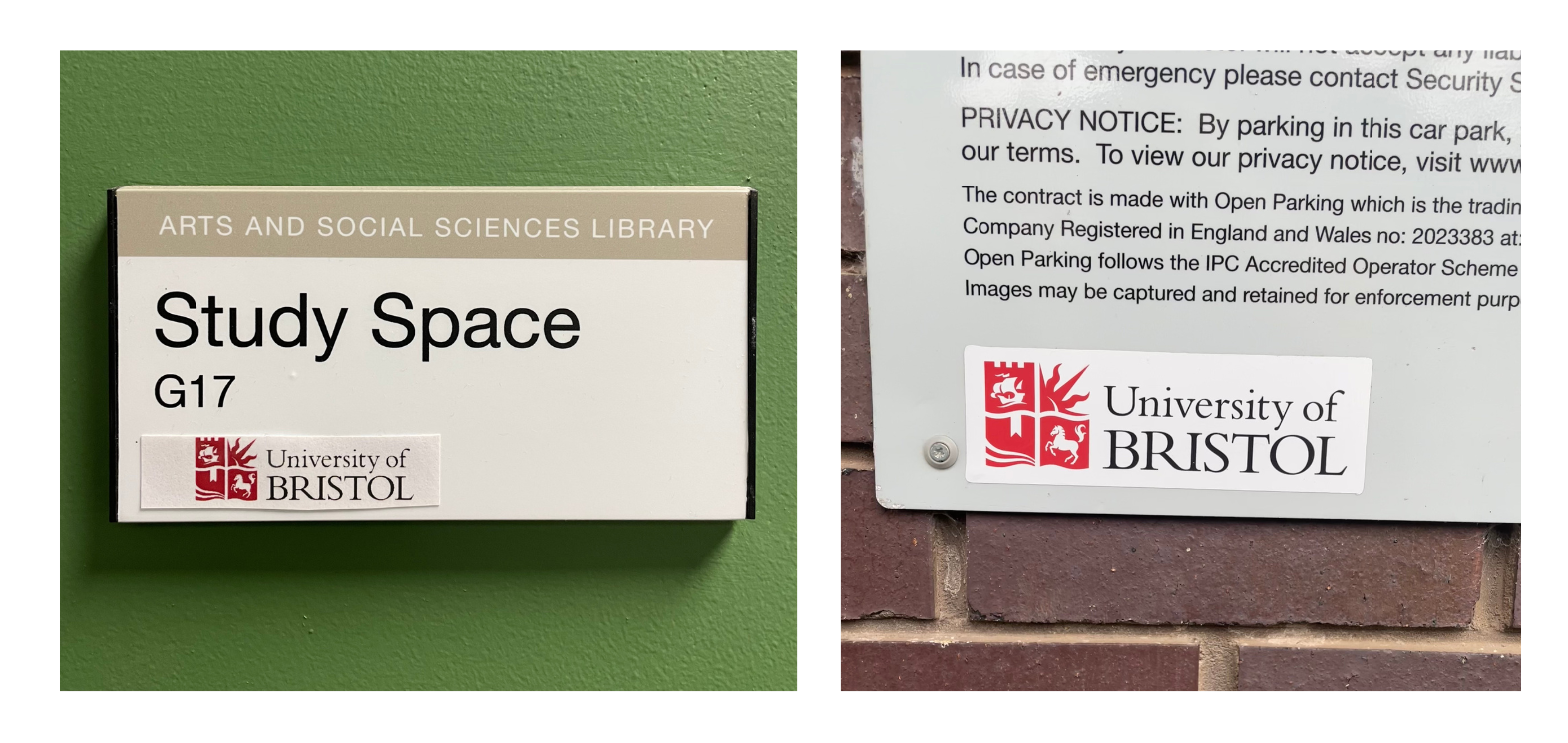
In total, I found over 20 different instances of the old logo inside the library, but once you start noticing them, its impossible to stop, and I kept finding them in stranger and stranger places.
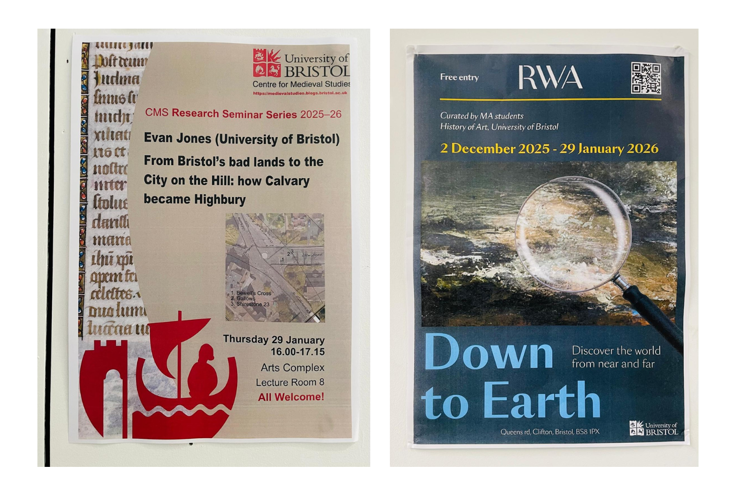
The logos started appearing in posters advertising new and upcoming events. The Centre for Medieval Studies is clearly still stuck in the past, advertising their 2025/26 seminar series using the old logo, and the same mistake was made, rather ironically, by MA History of Art students.
Like most institutions, the University of Bristol has branding and design guidelines. According to the brand identity page on their website, the university has ‘a range of ready-to-use toolkits featuring resources and templates for you to download and use,’ but these are only readily accessible with a staff log-in.
Many of the old logos haven't been completely replaced but instead covered up with paper or vinyl labels. In line with the university's 2024 statement, this is both a greener and cheaper option, as opposed to entirely replacing otherwise perfectly good signage.
Still, some students, or perhaps staff, have taken the logo into their own hands, drawing over the dolphin in an act of creative intervention.
The university has had a very effective online overhaul – almost all of the external digital logos have been replaced. There was only one that Epigram found to fall through the cracks. Having submitted an unrelated Freedom of Information (FOI) request to the university, Epigram's news editor, Cara Hene, noticed something fishy in their reply.
This process was always going to take time – the university has always made that clear and has stuck to it's word. However, two years on from the change it is surprisingly easy to find the Colston dolphin lurking in every university building. This change demands significant attention to detail and, without a clear timeframe for the university commit to, it's hard to tell from campus that these changes are still being prioritised.
Featured image: Epigram / Julia Mullins
Have you spotted the old logo on campus anywhere lately?


