By Ella Wilson-Coates, Third Year English and Philosophy
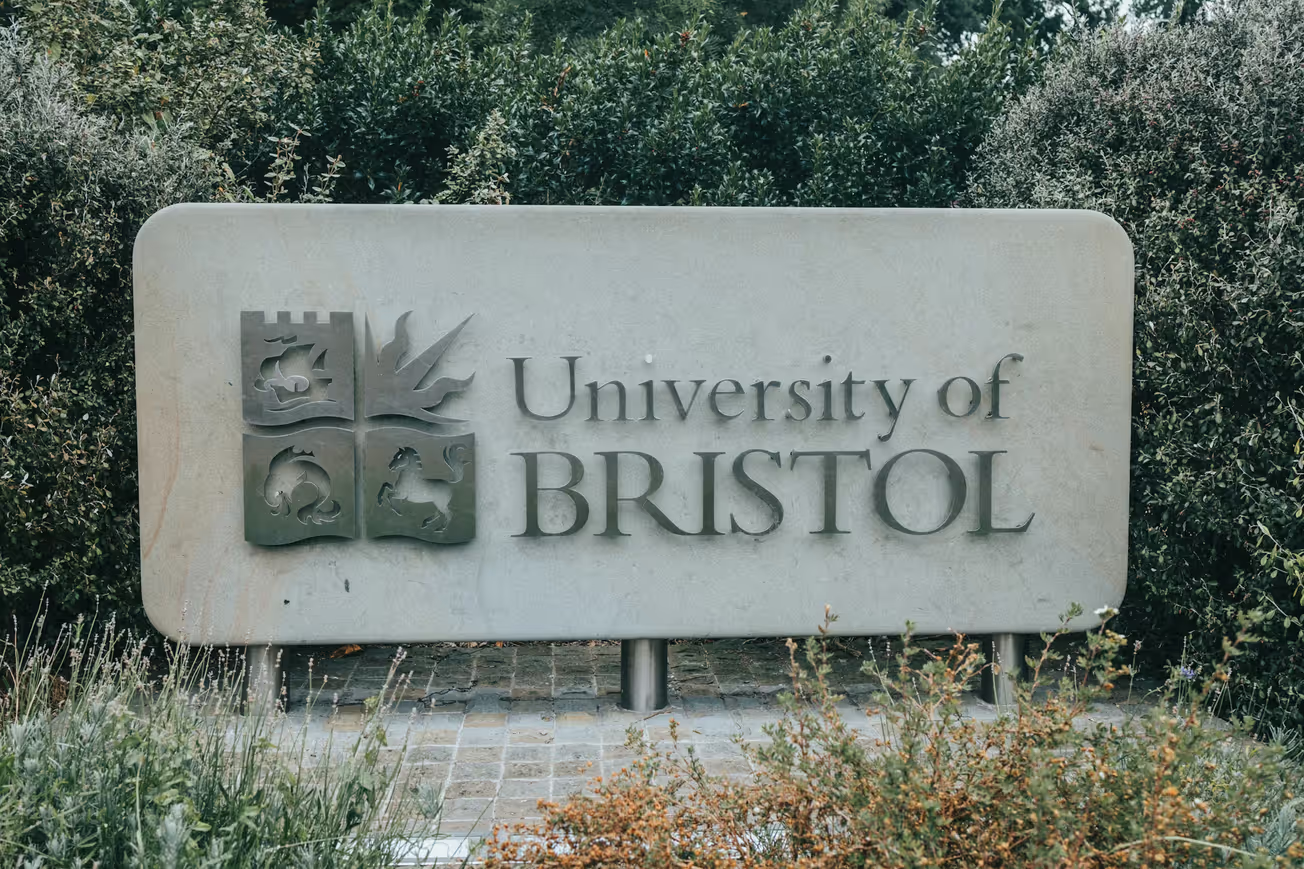
After the removal from his plinth during the Black Lives Matter movement in 2020, Edward Colston’s image has been further disassociated with the Bristol identity after the unveiling of the University of Bristol’s new logo.
The decision to remove Colston’s emblematic dolphin from their logo, due to Colston’s involvement with the transatlantic slave trade, comes as part of the University’s 'Reparative Futures' programme. In its place the previous depiction of a waving page is enhanced to include a bookmark and the turning pages of a book.
On their website introducing the new logo the University writes:
‘So what does a logo represent? What does it say about you? In a single glance your logo imparts a huge amount of information about you.’
The University recognises the weight of their logo and thus decided to change their logo to better ‘reflect [their] core mission around education and learning.’ However those who also share this mission of ‘education and learning’ may have found that Colston’s dolphin is not the only image on their logo that holds ties to families that profited from the slave trade. The portions of the logo depicting the sun emblem of the Wills family and the horse emblem of the Fry family remain unchanged.
The University justifies this decision due to the fact that the Wills and Fry families made financial contributions to the University whereas Colston, having died two hundred years before the University's founding, had not. Additionally the University writes that ‘we cannot forget our connection to our founders – even if that connection is uncomfortable.’
Another company that still bears a resemblance to its founder’s coat of arms is Nestlé. Nestlé’s logo depicts a mother bird in a nest with her young, as though returning to feed them. However, this is not the only connection that Nestlé has to mothers and the care of their children: we should remember Nestlé’s infamous formula scandal.
In the 1970s it was reported that Nestlé representatives had gone to Africa, Asia and Latin America offering mothers free infant formula, which Nestlé claimed was healthier for their infants. However, not only was this claim not validated, but moreover Nestlé never planned for this formula to remain costless. Once mothers were ‘hooked’ on the formula, Nestlé suddenly started charging them again. By discouraging mothers from using their own natural resource and replacing it with their formula which cost them ‘up to one-half the average daily wage’, Nestlé’s marketing strategy forced these mothers into a position where they had to make their money stretch. Thus, they diluted the formula with water that was oftentimes contaminated in order to make it last longer. This led to their babies becoming malnourished and dying by consequence. Nestlé created a need for their formula where there was none and in doing so caused the deaths of these children in the name of profit.
As it states on the University of Bristol’s website a single glance at a logo imparts information about that company to you. However, while logos may portray their companies or institutions in a certain light it does not always follow that the company's ethos is actually aligned with the supposed ‘information’ that their logos convey to the consumer. Nestlé’s logo denotes care where the company itself seems to have none. Logos seek to impart the image and information that the company wishes to impress upon the public, rather than the core of what the company truly values. The University of Bristol has taken a step to amend this type of contradiction with a new logo that better represents their commitments. But, still with two families that profited from the slave trade on their logo, we can hope that they continue to listen to their student and staff body by continuing to address and amend not only their logo but that which it aims to represent.
Which logos have surprised you with their meaning?


